rophil.co.uk
Website layout
I love typography and design, but I really struggle to realise my designs with HTML and CSS. If only I had more time to really get to grips with it! As a result, when redesigning rophil.co.uk, I took the lazy way out and searched for an elegant and minimal website template to copy. My staring point was the rather lovely Smooth theme for WordPress, which I briefly used on my late and unlamented blog A Vague Sense of Unease, which appeared on the previous incarnation of rophil.co.uk, until it was hacked by some worthless moron with nothing better to do than target websites using scripts written by other people that he was probably too stupid to actually understand, but sadly just about intelligent enough to be able to run...
Sorry, got a bit side-tracked there. Anyway, after literally minutes of googling, I found what I was looking for in Mint idea. It was simple. It was elegant. And, more importantly, it was free. I have to confess, I have hacked it around a bit (largely removing stuff I don't really understand, in true luddite fashion). In the original, the background colour of the links in the navigation banner changed when you hovered over them, and I thought it looked a bit naff, largely because the links are all different widths.. And I changed the colour scheme, making the background a sophisticated gray and the text my favourite telephone number purple.
My Favourite Font
The rophil.co.uk logo at the top of the page is in a lovely font called qlassik, which was designed by Dimitri Castrique. I first encounterd this font in the Smooth Wordpress theme (see above), although as it was a webfont it was tricky to dig out its name. Sadly, the logo does not show off the best letter of this font, the lower case g – truely one of the most gorgeous lower case letters I have ever encountered! You can see the full loveliness below:
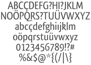
Should you wish to use this font, it can be downloaded from several different on line font repositories (for example here and here), or you can package it up to use as a webfont (as I have done for this website) using this website.
The Coverflow-like Image Viewer
If you have been looking at my Programs, you have probably noticed the lovely Coverflow-style image gallery. You can't miss it, it is at the top of each program's page, showing screen-shots and generally looking very spiffy indeed. This is created by an amazing little Javascript package called ContentFlow, by Sebastian Kutsch. Unlike many suchpackages, it is completely stand-alone, and does not simply piggy back off the ubiquitous JQuery package. Configuration was a little tricky, until I bothered to read the documentation!
A final note
If you have been diligent enough to get this far – and I applaud your resiliance if you have, but question what you are doing with your life it you have nothing better to do! – you may be left with one nagging question: why did he call the text colour telephone number purple? (Before I answer that question, let me just point out that I like the irony that the phrase telephone number purple actually appears as white text!) The answer is actually depressingly simple: a trick I have used once or twice is to use a 6 digit telephone number as a 6 digit hexadecimal colour code. My childhood telephone number 824391 just happened to specify a rather lovely purple!